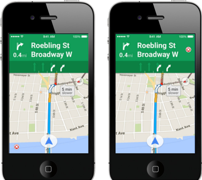
The problem states that, currently, on the Google Maps application, the cancel button is positioned in the bottom-left corner. UX researchers have found that users would feel more accessible to find the cancel button on the top-right corner based on user interviews. The researchers want to confirm this design based on empirical data to determine the UI reform.
How would you design the experiment and analyze data?
Data set was provided.
Team:
Solo
Tools:
IBM SPSS
The experimental design begins with formulating a hypothesis —an educated guess about causation.
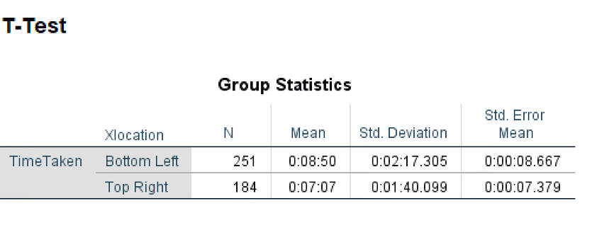
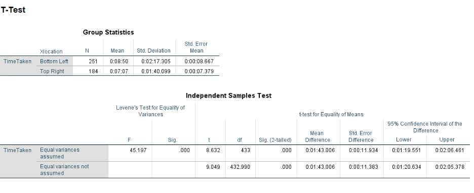
My hypothesis for the problem is that the Google Maps users will take much less time to find the cancel button if it is on the Top Right side.
Defining the variables for our experiment:
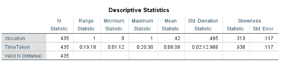
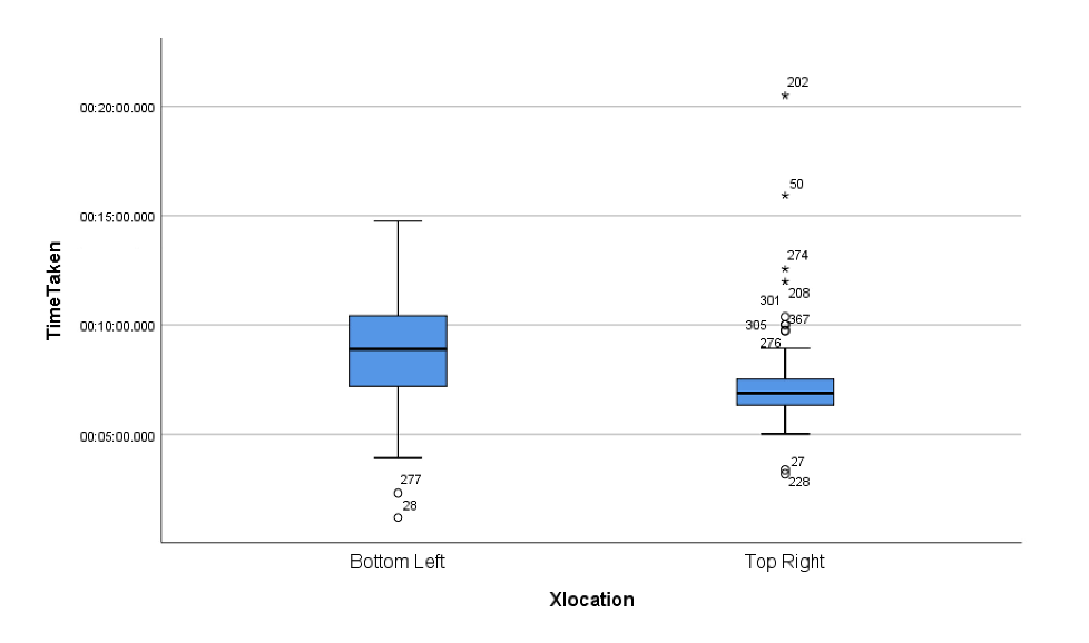
The location of the cancel button (Xlocation) on the Google Maps application, i.e., bottom-left / top-right
The time taken (TimeTaken) by users to find and click on the cancel button
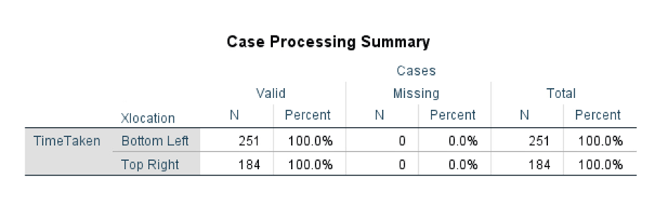
For this experiment, I will chose ‘Between-subject design’. In order to avoid order effects and obviousness of the experiment, I will assign different participants to view different locations of the cancel button.
What is ‘Between-subject design’?
Between-subjects is a type of experimental design in which the subjects of an experiment are assigned to different conditions, with each subject experiencing only one of the experimental conditions.
Interested in collaborating with me? Or, have any feedback? I’d love to connect with you!
Email: Shubhangislal@gmail.com